February 17, 2026
UX Design Challenge: From First Build to Design Judgement
Building, refining, and deploying a UX feedback tool using AI as a collaborator to transform a functional prototype into a deliberate, well-designed product.
Part 1
Over the past few months, I've heard various versions of the same advice being repeated by hiring managers, senior designers, and project leads: "If you're early‑career right now, you need to show that you can ship real products using AI."
This advice ultimately stuck with me because it clarified a gap I needed to close to show my qualification in today's fast evolving landscape: building end‑to‑end with AI as a collaborator.
So, I started my "Building with AI" journey last year, when I used Framer AI to build a basic travel-planning website. I won't go too deep into the details (you can read that article here if you're interested), but the short of it is that this prompt-to-prototype technology was still too early to accurately implement my designs without extensive manual interventions.
We've come a long way since then. Now, we have tools like Cursor that not only turn prompts into coded and interactive prototypes, but also are able to plan next steps, self-correct errors, and even give me ideas of future designs and features. I first began using Cursor to implement my designs at AI Alignment Liaison and saw first-hand its abilities in engineering and troubleshooting; it felt so empowering to use!
That experience inspired me to try building my own little product, and this article is going to be all about that!
What to Look Forward To
The article itself will be split into a 2-part series. In this first part, I focus on the product idea, constraints, and AI‑assisted workflow. I will also share a version of the tool as it exists today, which was built largely by following an AI‑generated plan and incorporated deliberate human judgment along the way.
Part 2 will go deeper into where I intervened, what I changed, and how I would evolve this tool further.
In total, this 2-part series will be the first of the major quarterly projects for this year of Through the Design Lens. I hope you will enjoy learning about my process and actually interacting with the final product at the end!

Real User Testing (Made with Canva and Edited with ChatGPT)
The Problem I Want to Solve
In a perfect world, every idea, design, or product should be tested by real users prior to completing development or final shipping.
However, when it comes to small/side projects, early-stage products/startups, or juniors trying to practice real-world decision-making, testing with real users can require time and costs that aren't affordable, accessible, or justified at that stage. Asking friends, family, or any close network can also result in feedback that is subjective, inconsistent, biased, or even irrelevant, depending on the product or target audience.
I, for one, have faced this situation countless times, both as an individual practicing design and as an official designer for a startup. So, I decided to build a lightweight, front-end only product that could:
- simulate different perspectives (designer, stakeholder, end user, accessibility expert) to highlight competing priorities and blind spots that often get missed when designers evaluate their own work
- provide feedback that feel structured, not generic
- deliver something fast enough to use during early iteration, not weeks later
This product is currently called the "Wireframe Critic" (it's a working name), and the aim is to solve a real pain point: getting meaningful UX feedback early when real user testing isn't feasible yet.
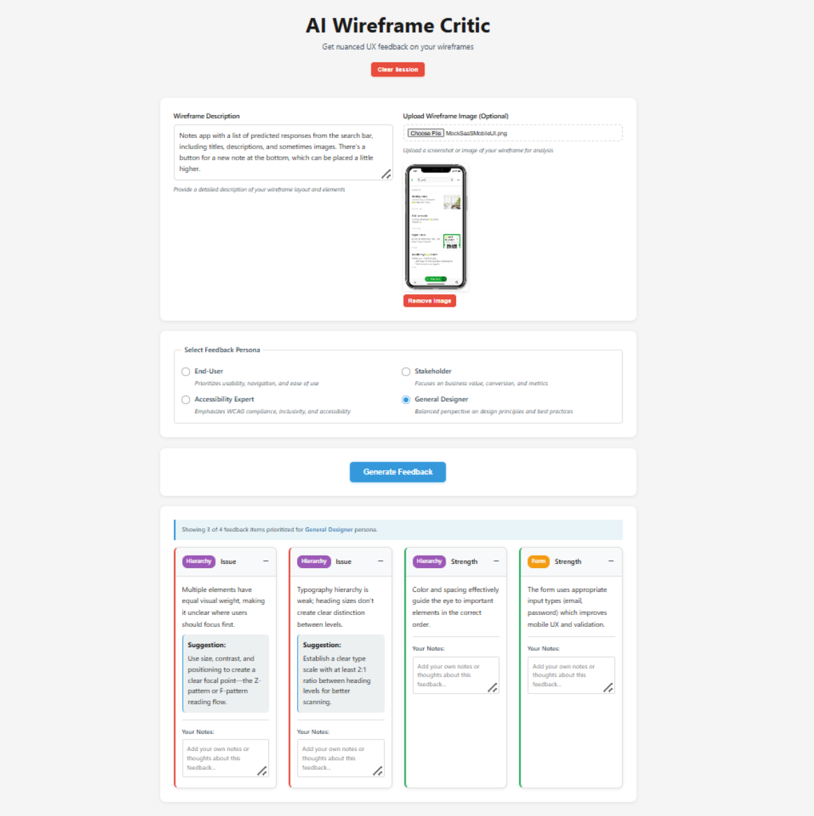
What Wireframe Critic Actually Does
At a high-level, Wireframe Critic is a single‑page, frontend‑only tool that simulates early UX feedback using simple rule‑based logic.
Through this product, users can:
- Describe a wireframe or early design in text
- Optionally upload an image (to help it recognize and provide feedback for mobile designs)
- Select one or more personas (designer, stakeholder, end user, accessibility expert)
- Receive 4–6 pieces of structured feedback per persona
- Regenerate, annotate, or export that feedback
It's important to note that this product is not meant to replace real user research or testing. As a frontend-only tool, its role is to simulate personalized feedback as realistically as possible during early stages, acting as a thinking aid that surfaces blind spots, questions, and tensions before more time or resources are invested (ultimately making later user research more focused and intentional).
How AI Fit Into the Workflow
As you already know, I used AI (Cursor) to build Wireframe Critic. However, AI was involved much earlier in my process, even when defining the pain point.
For this initial step, I used Grok to brainstorm and narrow down product ideas, pressure-test feasibility and scope, and decide what not to build. Once the concept felt grounded, I moved into Cursor to outline a realistic, phase-based plan and implement it, all while continuing to check back with Grok to validate logic, assumptions, and tradeoffs along the way.
Rather than treating AI as a single source of truth, I intentionally used multiple systems to check each other and reduce blind spots. My role throughout was to decide when to follow the plan and when to intervene.
There were several moments where my intervention mattered, such as:
- Correcting a UX logic decision: Originally, Cursor designed the main action button so it said "Generate" only the first time a user interacted with the tool, then permanently switched to "Regenerate" unless the page was refreshed. This didn't feel intuitive to me, especially since users can change their inputs. I stepped in to adjust the logic so the button resets to "Generate" whenever the core input changes (i.e. text or image), while remaining "Regenerate" only when personas change for the same input. This better matched how I expect users to think about generating feedback to avoid unnecessary confusion (i.e. I matched functionality to existing mental models).
- Ensuring core functionality before moving on: When Cursor first implemented the "Export as PDF" feature, it only exported a blank file. I paused at this point and re-prompted Cursor multiple times until the PDF actually included the generated feedback. I treated this as something that needed to be fixed right away, because Cursor still had the right context to make the correction. Besides, I believed that letting small functional issues pile up would have made it harder to properly improve and evaluate the product as it evolved.
- Reverting a small UI change: At one point, Cursor changed the layout of the "Regenerate" button from its original placement. Even though this was a small change and wouldn't affect future steps, I preferred the original layout and felt it made more sense in context. Since reverting it wouldn't disrupt the rest of the plan, and Cursor had fresh context for this button's layout, I had Cursor switch it back before moving on. Other UI changes were intentionally left for later, once the full plan was implemented.
Ultimately, I went back and forth between Grok and Cursor frequently: reviewing diffs before applying changes, testing each phase locally, pausing execution to rethink UX or logic, and using AI to help debug unfamiliar territory without blindly accepting its output.
So, while AI led much of the generation, I led the decisions.
The Step-by-Step Progress of the Wireframe Critic Following Cursor's Plan
The Constraints I Chose
To keep this project realistic and shippable, I set clear constraints from the start:
- I stayed frontend‑only (with no backend or APIs).
- I used simple rule‑based logic instead of real LLMs or computer vision.
- I avoided heavy libraries or frameworks.
- I kept the scope to a single, maintainable page.
While I could dive into these areas further and expand the scope and possibilities of this product, the ultimate goal was to quickly ship something functional that solved the major pain point, hence serving the purpose like an MVP. Furthermore, such constraints mirrored the kinds that real product teams face when balancing time, cost, lack of knowledge/resources, and risk.
What I Deliberately Didn't Do
Besides the constraints, I had to be strategic in shaping my MVP. A tool that aids people in receiving quick, personalized feedback without spending time or money on real user testing has the potential to expand in various different ways, including:
- Adding real image analysis or vision models
- Over‑engineering the logic
- Introducing accounts, analytics, or collaboration features
- Optimizing for visual polish over usability
Since the goal of Part 1 — or of this entire design challenge for that matter — wasn't to create a "perfect" product, I chose not to pursue anything from this list. As long as I establish a working, credible baseline that could be evaluated, critiqued, and improved through real feedback and iteration, I have accomplished my goal for the Wireframe Critic.
Final UI of the Wireframe Critic
Try It Out Yourself!
For the first time in Through the Design Lens, you can interact with my designs completely on your own!
Click here to try out Wireframe Critic: https://wireframe-critic.vercel.app/!
This version reflects what the product looks like after following the AI‑generated plan, with practical human intervention along the way.
In Part 2, I'll share:
- Where I stepped in as a designer
- What I changed or would change
- How real user feedback would shape the next iteration
Some Final Thoughts
Building and shipping this project clarified something important for me: the most meaningful design work often begins after something exists.
Once there was a working product, my role wasn't to generate more output. Instead, I had to evaluate what was created by determining what felt solid, what felt fragile, what was unnecessary, and what introduced risk or confusion. That kind of judgment doesn't come from tools or prompts, but from understanding users, systems, and consequences. In practice, that meant knowing to step back, assess what's in front of me, and take responsibility for where it goes next.
In Part 2, I'll focus less on what was built and more on how I think once something tangible exists, including the decisions I'd revisit, the directions I'd push further, and the tradeoffs I'd challenge if this were evolving into a real product.
Until then, I'm curious: At what point in your own process do you feel most responsible for the outcome, either before anything exists or once there's something concrete to react to?
Part 2
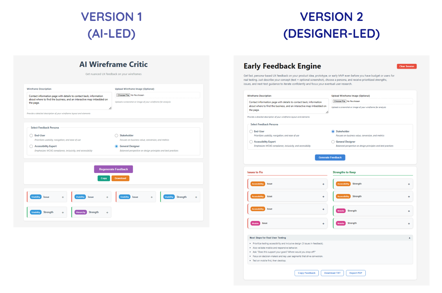
In Part 1 of this UX Design Challenge series, I built an AI-powered UI critique tool as fast as possible using Cursor.
It worked well, and Cursor even surprised me with what it included through its own interpretation of my overarching idea.
You could paste in UI copy and receive structured feedback (both issues and strengths) across usability, clarity, hierarchy, screen sizes, and interaction patterns. You could also download and save this information for further use.
In short, the system generated meaningful output, the interface functioned as expected, and the demo simulated a real AI-based product.
However, a product that works doesn't automatically mean it's designed with quality, intention, or efficiency. From a user experience perspective, the first version revealed several design maturity gaps.
Before I break down what those were and how I approached them, I'd like to give you the opportunity to try both versions yourself:
- Version 1 (AI-led first build): https://wireframe-critic.vercel.app/
- Version 2 (Revised with applied UX judgment): https://early-feedback-engine.vercel.app/
Beyond the obvious UI differences, I recommend testing the same input in both to compare the outputs. I'd love to hear what you notice and which version you prefer!
Refining Functionality to Intentionality
Now, let's take a look at what Version 1 was missing.
The issues I found were not technical bugs (if any came up, those were pretty easy to fix as I worked anyways); rather, they were gaps within design maturity.
For example:
- There were actions/buttons that competed for attention instead of guiding progression.
- Feedback sometimes changed for the same input, making future iteration unreliable.
- Visual signals (e.g. color, badges, hierarchy) overlapped in meaning, causing both visual and cognitive confusion.
- The system generated critique, but didn't help translate it into next steps, which was the core of the pain-point I wanted to solve.
None of these issues would break in a demo. If anything, they might even be completely missed if the product wasn't tested with real users.
However, in a real workflow, leaving these issues unchanged would result in:
- Slowing users down instead of accelerating them
- Undermining trust in its outputs
- Increasing cognitive load during review
- Encouraging passive reading instead of active iteration
This is just to name a few. So, it became crucial for me to switch my mindset from "Does this product work?" to "Would users/designers actually rely on this?"
To answer that, I grouped the improvements into four distinct categories:
- Flow & Interaction Hierarchy: Restructures how actions and information progress
- Visual & Perceptual Clarity: Reduces noise and clarifies signal layers
- System Reliability & Predictability: Eliminates randomness and improving trust
- Actionability & Workflow Integration: Bridges output into real testing behavior
Each category addressed a different failure mode of early-stage builds.
Together, they transformed the tool from a functional prototype into a structured evaluation instrument.
Flow & Interaction Hierarchy - Version 1 vs. Version 2
1. Flow & Interaction Hierarchy
The first version contained the right pieces, but they weren't in the sequence that matched the order users would follow when interacting with each section of the product. The early build also treated all actions as equally visible, making it difficult for users to quickly find the content they're looking for.
What changed:
- Reordered information architecture to reflect the user's mental progression (Input → Generate Feedback → Review/Add to Structured Critique → Export Data)
- Clarified primary vs. secondary CTAs (call-to-action, e.g. "Generate Feedback" button)
- Renamed secondary buttons for specificity instead of generic system language
- Relocated the "Clear Session" button to reduce accidental disruption
Nothing new was added, but the experience shifted from "available" to "guided", which is precisely the purpose of this product.
This category of changes is a good reminder that a well-intentioned flow removes unnecessary decisions and maintains momentum within the user's experience.
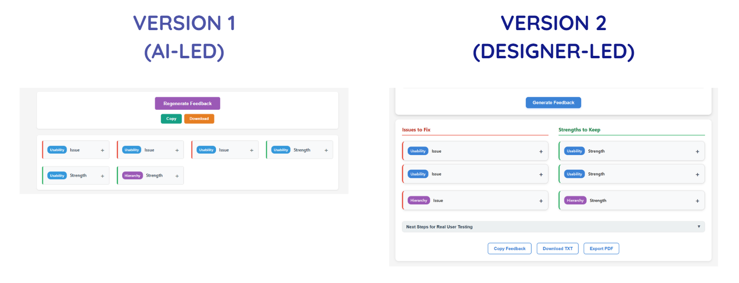
Visual & Perception Clarity - Version 1 vs. Version 2
2. Visual & Perception Clarity
Once flow improved, attention became the next constraint.
In the initial build, everything tried to stand out, but that's exactly when nothing actually does.
By separating type of feedback (issues vs. strength), category of issue (usability, hierarchy, etc.), and action affordance (buttons vs. informational elements), the interface becomes easier to scan and cognitively parse.
In other words, while the first version surfaced information, the second version structured how it's recognized and perceived.
What changed:
- Refined the color system to reduce competing signals
- Separated category badges from severity indicators
- Split feedback into two columns: Issues and Strengths
- Made the interface more compact to improve scan efficiency
- Reworked the title and description to clearly communicate value and intent
These changes weren't simply to refine the UI's aesthetic; it directly improved and clarified the hierarchy of elements and content are understood, especially at first glance.
Such decisions require asking questions like "What deserves attention first?", "What should recede?", and "What should never compete?", and ensuring that the answers always prioritize actions that solve the user's pain point first.
System Reliability & Predictability - Version 1 vs. Version 2
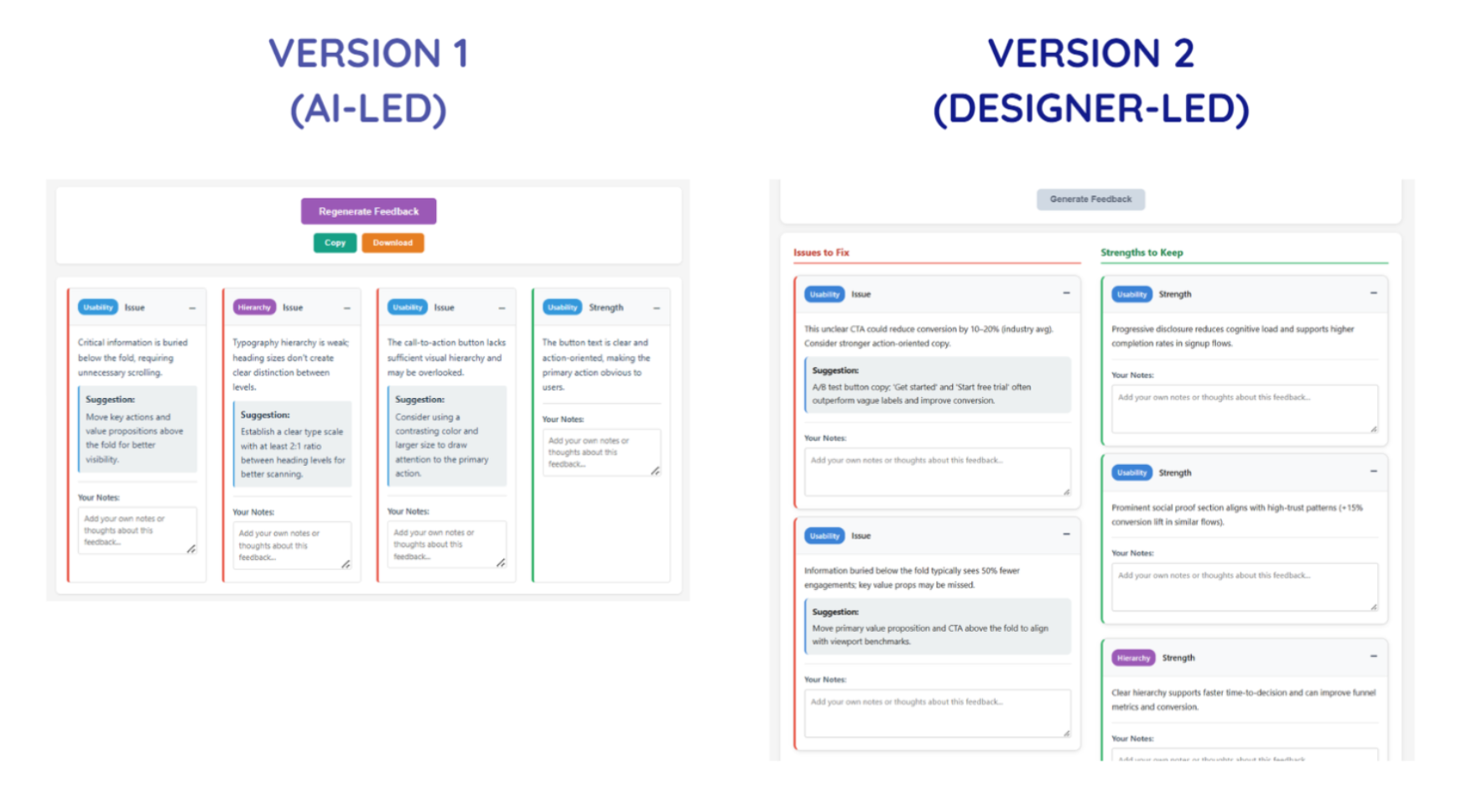
3. System Reliability & Predictability
This was arguably the most important shift, as it impacts the user's ability to trust and revisit the product.
In the first version, the feedback was presented with some slight randomness, as the same input could produce different combinations of critique cards.
That's interesting in a demo, but dangerous in a tool built specifically to support evaluation. If the output isn't predictable or consistent, users can't compare iterations, isolate improvements, or build trust.
What changed:
- Removed randomness from feedback generation (so, the same input now produces consistent structured output)
- Standardized to 6-8 feedback cards
- Disabled the primary CTA button during generation to prevent duplicate triggers
- Fixed export inconsistencies
This shift transformed the tool from a generative showcase into a stable and reliable evaluation instrument.
This category of changes helped me see how, while any working system can generate output, it's the credible systems that generate consistency — and so, trust.
Actionability & Workflow Integration - Only in Version 2
4. Actionability & Workflow Integration
If we revisit one of the major key outcomes for this product, it was to allow the simulated early-stage feedback to help signal to product makers or teams on what they should focus on when conducting real user testing.
If we look at Version 1, the final outcomes are the feedback themselves. This means that I needed to include one more feature that would help best integrate the product into the user's predicted workflow.
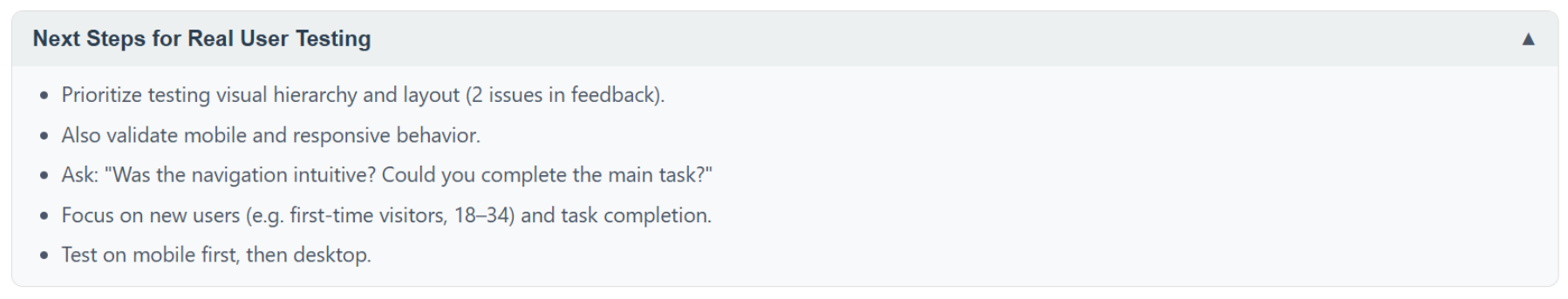
What changed:
- Added "Next Steps for Real User Testing"
- Made it collapsible but persistent
- Included it in export outputs
- Explicitly positioned the tool as a thinking aid, not a research replacement
AI critique should not replace user insights, but it can prepare you for them. To build toward that experience, this added section prompts users to:
- Identify assumptions surfaced in the critique
- Translate feedback into testable hypotheses
- Plan validation steps
As a result of this key decision, the feedback output transforms from raw data to leverageable next steps for the user, leveling up the product from a generator into a scaffold for iteration.
What I'd Revisit In a Real Product Environment
This project was exploratory, but if this were a real shipped product, there are several questions I would strongly consider and require deeper validation towards:
With real users, I'd want to understand whether deterministic feedback feels appropriately structured or overly rigid, whether 6-8 critique cards strike the right balance between depth and overload, and whether designers genuinely trust AI-simulated critique enough to act on it.
There are also assumptions worth pressure-testing. For example, it would be interesting to see whether structured categories truly improve comprehension, whether separating Issues and Strengths enhances clarity, and whether adding "Next Steps" actually increases follow-through rather than being ignored.
Post-launch, I would monitor risks, such as over-reliance on AI-simulated critique instead of user research, misinterpretation of feedback severity, and potential cognitive fatigue from repeated structured outputs.
It's important to also recognize that many of these refinements wouldn't remain solo decisions. Engineering constraints could influence generation logic, product priorities might affect depth versus speed trade-offs, and research insights would likely reshape how categories are framed.
In a real product environment, design judgment doesn't exist in isolation; rather, it sharpens through collaboration. It would be especially interesting to see how this product evolves when shaped by multiple roles and perspectives.
Some Final Thoughts
I've learned so much about design judgment, front-end coding capabilities, simulating AI, product team workflows, and more through this UX Design Challenge alone.
One of the biggest lessons I've learned is to trust my design judgment. Sure, the initial build proved I could ship something functional within a matter of days. However, my real design work began after the first version existed, by clarifying the flow, reducing perceptual noise, removing unpredictability, and closing the gap between feedback and action.
None of those changes were dramatic or novel on their own. Together, though, they shifted the tool from a working prototype to something more deliberate and dependable.
The role AI played in this second version's workflow was to accelerate the assembly and fix technical bugs. It didn't decide what needed structure, what required consistency, or where the experience introduced subtle risk. Those decisions came from stepping back, evaluating consequences, and trusting my judgment on which design decisions to move forward with.
Moving forward, I seek to perfect this standard of design: creating not just functional systems, but solutions that can be fully trusted.
If you've built something quickly, especially with AI, I'm curious: When you revisited your product, did you focus more on expanding it or stabilizing it?