DisasterReady Systems
Designing a behavioral system that helps people overcome fear and take action on disaster preparedness by turning uncertainty into clear, actionable steps.
Role
UX Designer, Visual Designer, Developer
Timeline
~10 weeks (Feb–May 2024)
Team
Myself (Independent project)

Project Overview
Challenge: DisasterReady Systems is a behavioral design ecosystem that helps people overcome fear and take concrete action on disaster preparedness by turning uncertainty into clear, actionable steps.
Project: The project combines an educational website, mobile kit-planning app, immersive VR + physical exhibition, and take-home pocket cards into a cohesive system that addresses both prevention and responsive needs.
Role: As the sole designer, I owned the entire experience: from research and concept development through visual design, interaction flows, exhibition setup, and frontend development.
Result: A multi-channel behavioral system that motivated >100 visitors to report clearer understanding and intent to prepare; validated in a real week-long public exhibition.
The Problem
Many people living in disaster-prone areas delay or avoid preparing for emergencies. Through both my research and during the exhibition where I interviewed visitors, I learned that most people shared the same barriers:
- Uncertainty about what to prepare and in what order
- Feeling overwhelmed by the sheer volume of tasks and information
- Fear or emotional avoidance when thinking about disasters
Traditional awareness campaigns (posters, checklists, websites) fail because they rely on passive information alone. Without emotional engagement and clear next steps, knowledge rarely turns into action.
My Role
This was an independent thesis project. I designed and built the entire experience end-to-end, including:
- Research and concept development
- UX and interaction design
- Visual design and illustration
- Website and mobile app prototyping
- VR simulation experience
- Physical exhibition design and setup
- Frontend development and implementation
I also collaborated with the exhibition producer on logistics and ran all user observations during opening day of the public event.
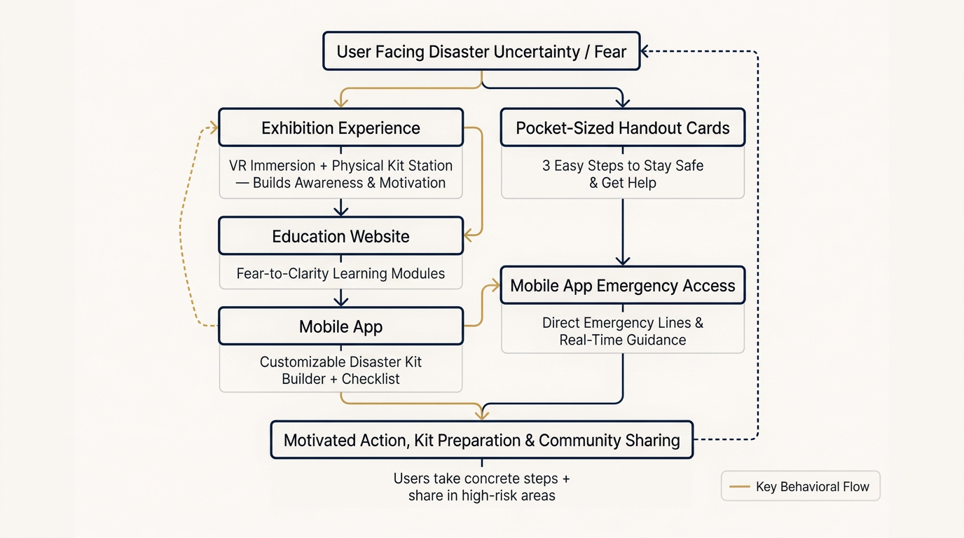
Strategy
The system was designed to move users through three stages:
- Awareness: Spark recognition of personal risk without triggering fear
- Emotional engagement: Create safe, immersive experiences that build motivation
- Practical action: Deliver clear, personalized next steps that feel achievable
This staged approach balanced accessibility, emotional safety, and immediate behavior change while working within the tight timeline and budget constraints.
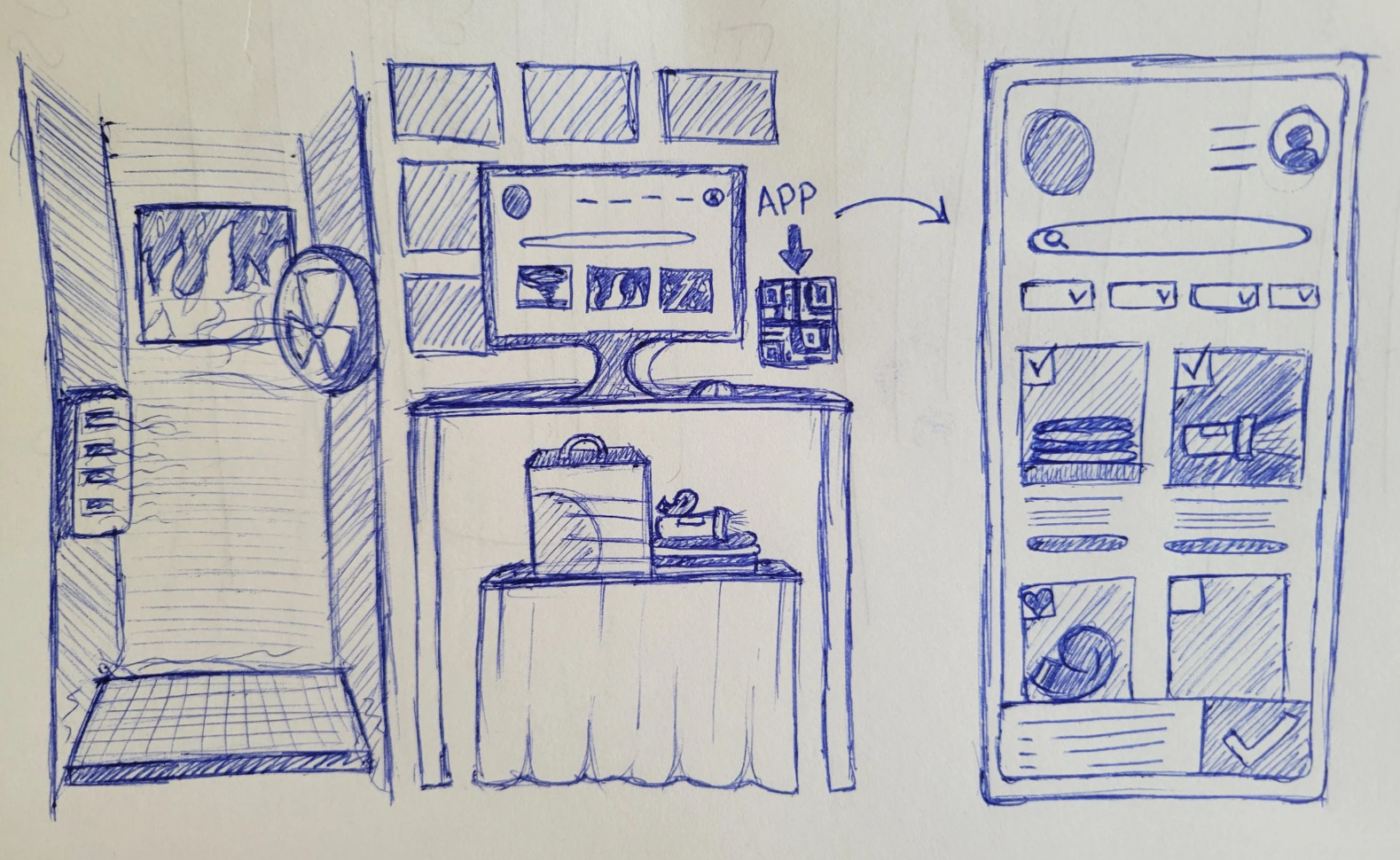
Early conceptual sketch of the immersive exhibition setup (showing integration of VR, physical kit station, and mobile app tie-in):
Constraints
While the three-stage behavioral workflow provided a clear strategic direction, several real-world limitations shaped how I executed and prioritized the design:
- Tight timeline: only ~10 weeks from concept approval to public exhibition opening
- Very small team: myself (sole designer and frontend engineer)
- Extremely limited budget: relied on existing hardware (VR headsets lended by USF), low-cost materials, and free/open-source tools
- Technical limitations: little-to-no code, no AI, and minimal features within free plans
- Single public deployment: one 2-day exhibition event with no opportunity for iterative public testing before launch
- Physical space constraints: fixed 8×8 ft booth footprint in a crowded venue
These constraints --- which evolved and emerged throughout the project timeline --- forced consistent, ruthless prioritization. I focused on emotional impact + actionable behavior change over feature breadth, and designed for maximum clarity in a short, high-attention environment.
Solution
Disaster Awareness Website
The website introduces different disasters and explains preparedness strategies in a calm, visual-first format. Clear categories and simple language help users quickly understand risks without feeling overwhelmed.
Emergency Kit Planning App
A mobile prototype helps users create and order personalized emergency supply kits. By following the same cateogries as the website, users can easily match their learnings into concrete action without the pressure to accurately determine the best next-steps on their own.
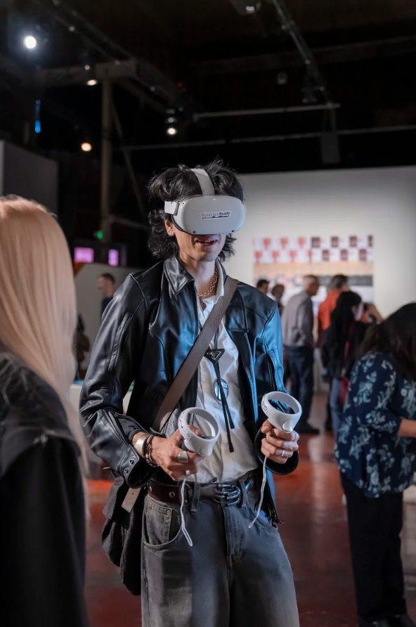
Immersive Disaster Simulation
Visitors experienced simulated disaster environments through a VR installation combined with a physical kit station. The experience builds emotional engagement and shows both why it's crucial to prepare for natural disasters and how that preparation directly reduces risk.
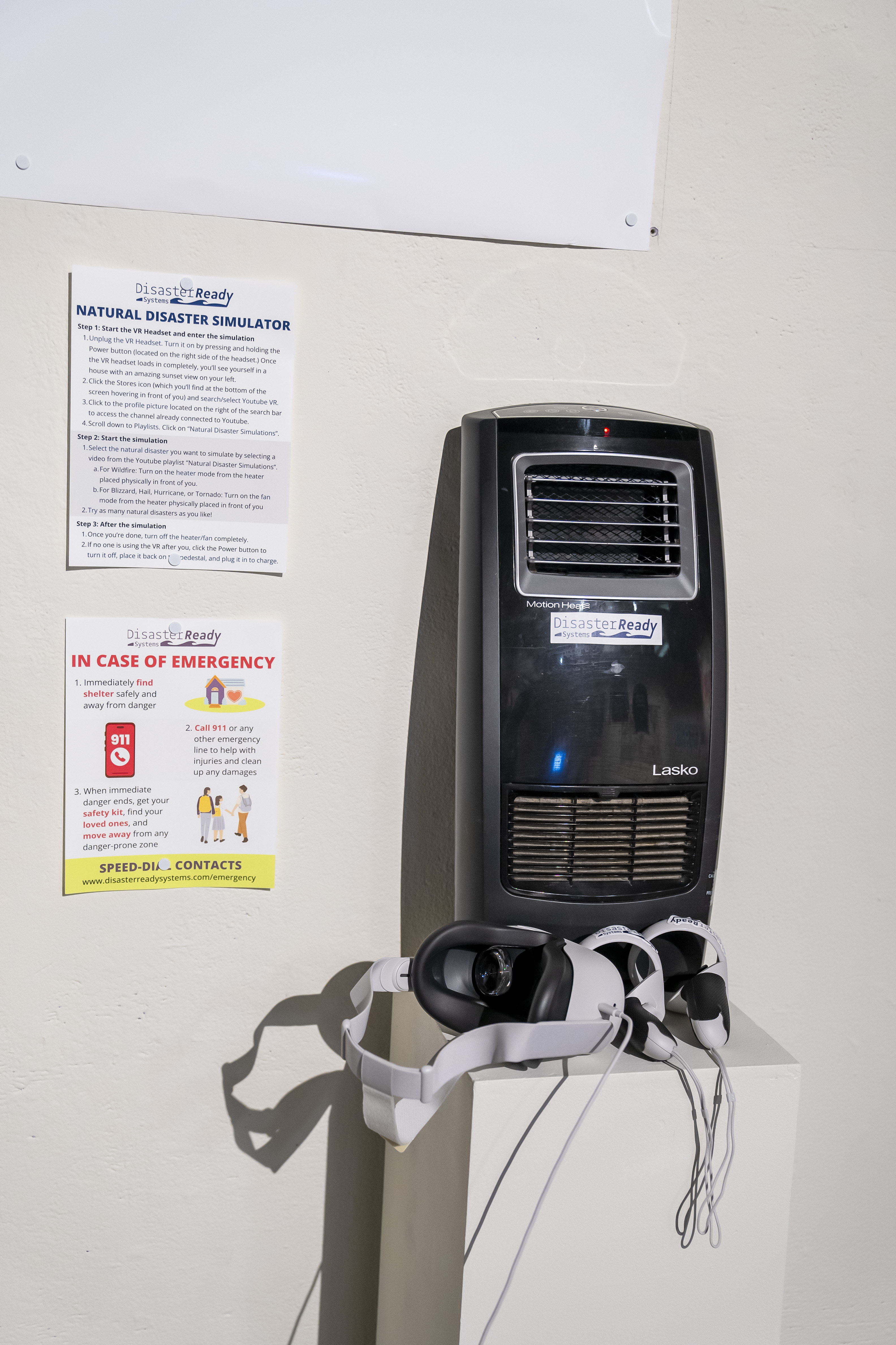
Emergency Pocket Cards
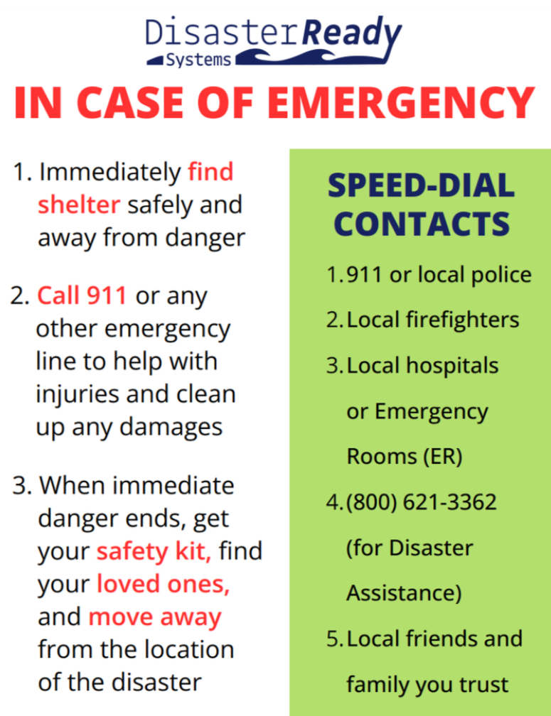
Take-home cards summarize preparedness actions visitors could implement after leaving the exhibition. Pocket cards were a direct response to user feedback during early stages of usability testing: people said fear and stress cause them to forget key steps after leaving. This low-tech addition closed the experience loop and increased perceived usefulness.
Outcome
The project was exhibited publicly for approximately one week. During the exhibition:
- More than 100 visitors interacted with the installation
- Visitors reported a clearer understanding of disaster preparedness
- Some expressed motivation to begin preparing emergency kits
- Several visitors mentioned wanting to share the concept with others in disaster-prone areas
These interactions provided informal validation that combining immersive experiences with practical tools can motivate preparedness behavior. The system proved that thoughtful design can turn abstract fear into concrete, scalable action.
Reflection
Designing across digital, physical, and immersive channels reinforced that real behavioral change requires systems, not isolated products.
Key lessons:
- Coordinated touchpoints beat single interventions: education builds knowledge, immersion creates motivation, take-home tools enable action.
- Constraint-driven focus wins: limited time/budget forced ruthless prioritization of emotional impact + immediate next steps over breadth.
- Real-world validation matters: 100+ visitors in a public setting confirmed the approach motivates without overwhelming.
- User feedback drives relevance: pocket cards emerged directly from visitors saying fear erases memory → closed the loop with a low-tech, high-impact deliverable.
- Scalability starts early: every channel was designed with future product/business potential in mind (app for ongoing use, cards for sharing, exhibition as proof-of-concept).
This project strengthened my ability to blend UX depth with systems strategy and business viability in high-stakes, resource-constrained environments.
Looking Forward
If I had more time or resources, I would pursue three main directions:
-
Longitudinal Impact Measurement
Track real post-exhibition behavior (e.g., kit assembly rates, follow-up app usage, self-reported preparedness changes) via optional QR-code sign-ups or short surveys. This would move the project from immediate engagement metrics to measurable long-term behavior change. -
Streamlined User Flow for Website
Reduce clicks to completion for accessing important disaster information (i.e., intuitive, quicker stream from Home page to a specific Natural Disaster page through location-based searches) to improve task efficiency and boost task success rates. -
Prospective Iteration and Scalability
Project towards full-scale deployment, strengthen the UX/UI framework, and optimize content for maximum usability and clarity across all digital touchpoints.
These next steps would bridge the current proof-of-concept exhibition into a more rigorous, scalable behavioral intervention system, exactly the kind of iterative, evidence-driven work I’m excited to lead in future roles.