Mission Bay Shuttle
Improving a transit app’s usability and adoption through a research-driven redesign of navigation, search, and route clarity.
Role
UX Designer
Timeline
~6 weeks (Feb-March 2024)
Team
3 designers

Project Overview
This project redesigned the Mission Bay Shuttle mobile app to improve route discovery, schedule clarity, and navigation usability for users in San Francisco’s Mission Bay area (UCSF campus, museums, transit hubs).
The app connects riders to free shuttle routes across dense urban locations with limited public transit options. Poor existing UX led to confusion, missed stops, and low confidence, especially for first-time or accessibility-needs users.
I contributed to the full research-to-prototype process in a 3-designer team, owning search-to-map flows, route filters, accessibility integration, and final interactive prototype connections.
Challenge: Users struggled to quickly understand shuttle schedules, locate routes, and feel confident in real-time travel decisions, exacerbated by small/unobvious controls, inconsistent patterns, and poor visibility of critical status/info.
Results: Redesigned prototype significantly improved destination discovery, route clarity, and decision speed, validated through two rounds of usability testing and iterative refinements addressing core heuristic violations.
The Problem
Heuristic evaluation and field testing of the original app revealed consistent pain points rooted in Nielsen’s principles:
- Visibility of system status: real-time shuttle movement was helpful, but critical updates (e.g., delays) were small/hard to notice.
- Match to real world / consistency: interface deviated from familiar mapping apps (e.g., accessibility button looked like Street View, unclear what controls did).
- User control & freedom / recognition vs. recall: small route button was hard to identify/understand until clicked; sticky accessibility button was easy to miss.
- Flexibility & efficiency / minimalist design: unnecessary top row of route buttons duplicated map functionality; overlapping route paths and tiny red announcement line reduced scannability.
- Help & documentation: question-mark button led to video tutorial instead of expected FAQ/Contact, causing confusion.
These issues caused delayed decisions, missed shuttles, and reduced adoption, critical in a transit-heavy area where reliability matters.
My Role
In a 3-designer collaborative thesis project, I focused on usability, interaction design, and prototype integration. Responsibilities included:
- Conducting full heuristic evaluation of the original app (10 Nielsen principles)
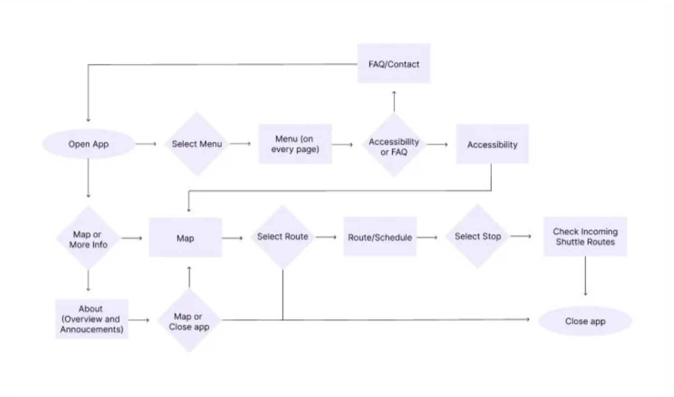
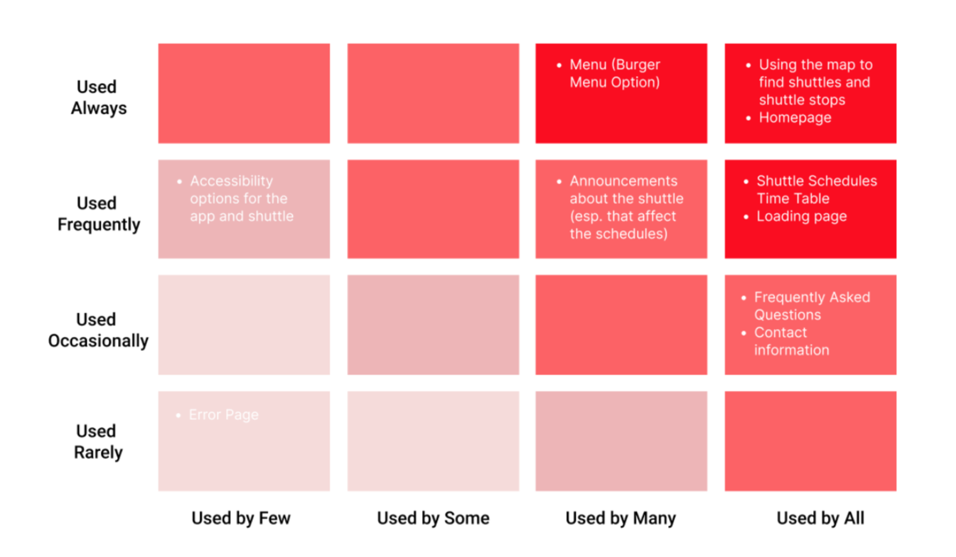
- Creating user personas, a user flow diagram, and red routes analysis
- Leading ideation, paper prototyping, and usability testing sessions
- Designing search-to-map flows, route filters, and accessibility screens
- Connecting all screens into a final interactive Figma prototype
- Running and synthesizing one round of field testing (I rode the shuttle and interviewed riders in real-time) and two rounds of usability testing (paper + Figma high-fidelity)
I bridged evaluation insights and user feedback into concrete interaction decisions, ensuring the redesign aligned with mental models while addressing business goals (higher adoption, reduced support needs, better real-time confidence).
Strategy
I aligned the redesign with users' existing mental models from familiar mapping apps (e.g. Google Maps and Apple Maps), directly countering the heuristic violations identified in evaluation.
More specifically, I prioritized:
- Destination-first search over schedule-first browsing (addressed unclear navigation and recognition issues)
- Map-based route discovery as the primary view (improved visibility of system status and real-world match)
- Larger, more obvious controls + contextual filtering (fixed small/unobvious buttons, overlapping paths)
- Direct surfacing of accessibility and real-time info (resolved sticky/hidden accessibility button and tiny announcements)
This approach balanced quick decision-making with accessibility and confidence, key for a shuttle system where users often make choices under time pressure.
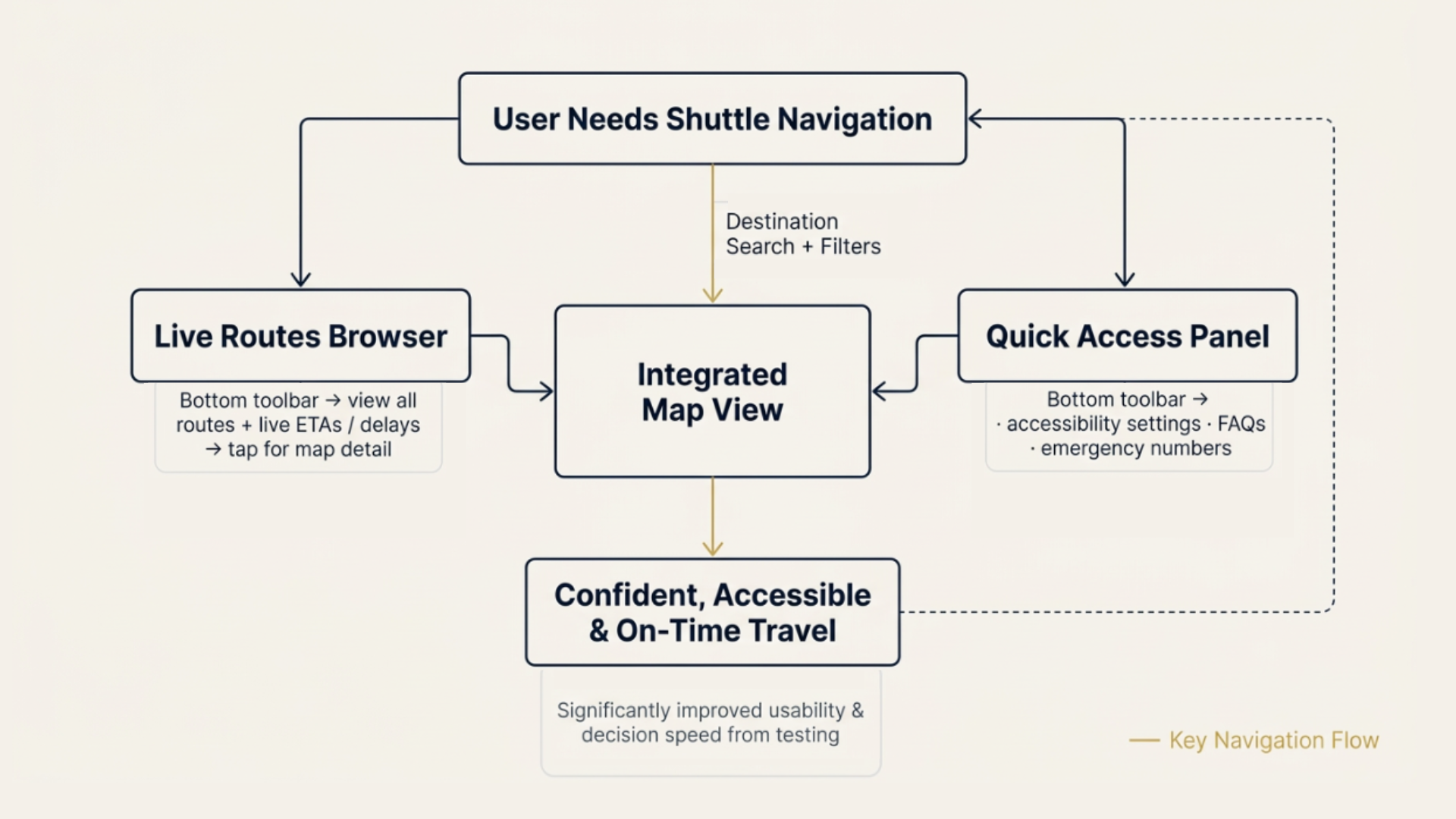
Solution
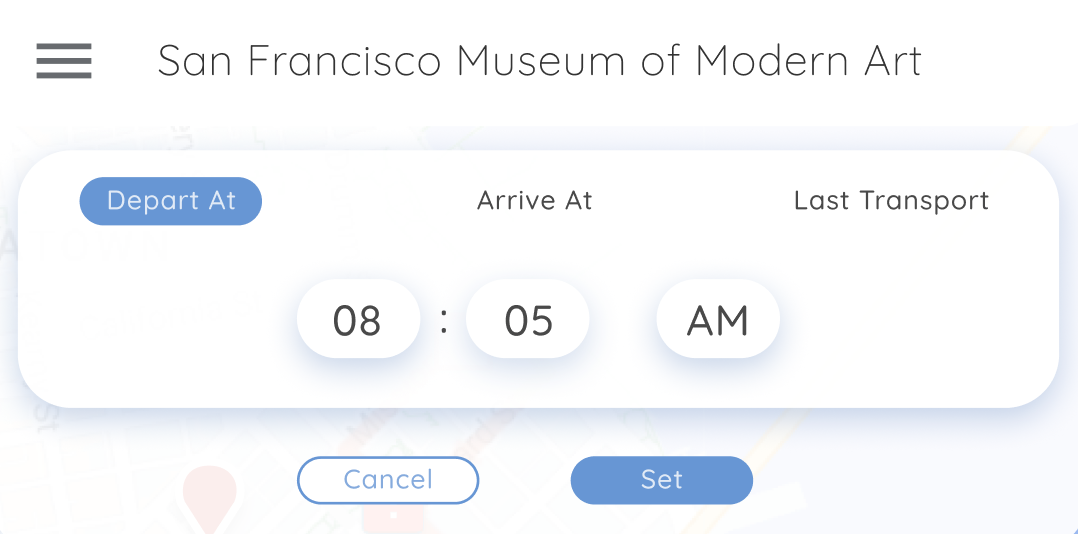
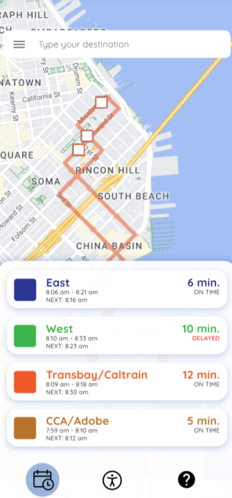
Search-to-Map Interaction
Users search for a destination and immediately see route options overlaid on the map, reducing steps, improving recognition, and matching familiar mapping patterns.
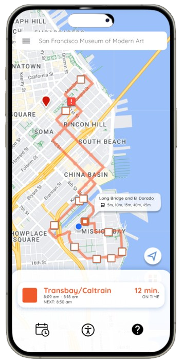
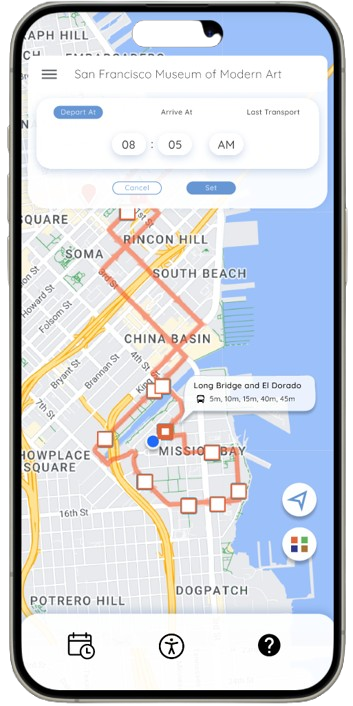
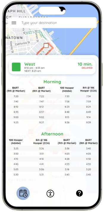
Route Filters
Filters for departure/arrival time and last shuttle availability appear contextually, helping users quickly narrow options without leaving the map view and addressing efficiency/flexibility issues.
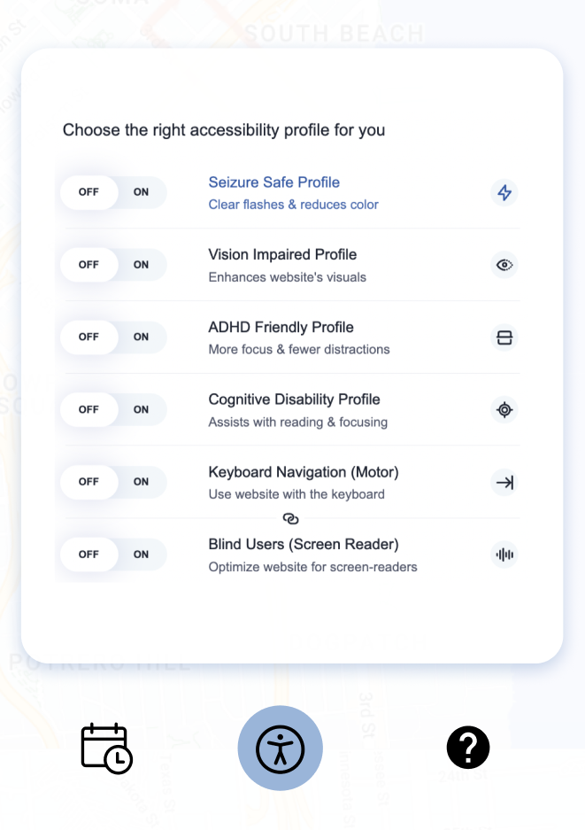
Accessibility Information
Accessibility details (e.g. ADHD-friendly profile, vision-impaired, keyboard navigation) are accessible directly from the toolbar, fixing the misleading Street View-like button and sticky/hidden placement.
Full Prototype Demo
View the interactive Figma prototype showing the end-to-end flow (including teammate contributions connected by my integration work):
Before → After
Before (original app; key testing/heuristic issues)
- Confusing schedule tables → most participants found them unclear or extra effort
- Small/unobvious route and options buttons → users couldn’t predict function until clicked
- Low discoverability of additional info → only ~33% found it easily
- Web app format → Difficult to view, navigate through, and interact with the map and additional features on a mobile device
After (redesigned prototype)
- Map-first route discovery with real-time overlay → faster, more intuitive decisions
- Larger, contextual filters/time selection → clearer affordances and reduced confusion
- Direct accessibility surfacing in the toolbar → better visibility and confidence
- Mobile app format → Intuitvely supports common mobile-based user flow that exists when on-the-go
Original App vs. Redesigned Prototype
Outcome
Two rounds of usability testing (paper prototypes → high-fidelity Figma) showed significant improvements:
Round 1: Hallway testing (paper prototypes, 6 participants)
Revealed strong preference for map/real-time views over schedules, confusion around tables/buttons, and low burger menu discoverability; this directly shaped the map-first strategy and clearer controls.
Round 2: High-fidelity Figma testing
Validated significant improvements:
- Faster destination discovery and route selection
- Higher confidence in real-time decisions
- Clearer understanding of filters and accessibility options
- Reduced confusion around interactive elements and next steps
Qualitative patterns:
- Most participants compared favorably to Google Maps
- Many preferred real-time updates over schedules
- Controls (filters, time selection) felt more intuitive after refinements
These results validated the redesign direction and informed final refinements.
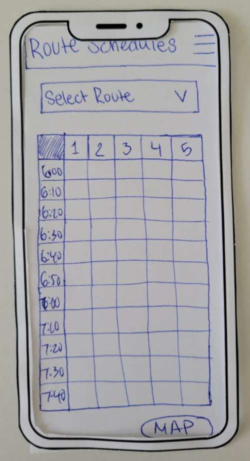
Paper Prototype → Refined Solution
Reflection
Several lessons emerged from this collaborative project:
Mental models drive clarity
Aligning with familiar mapping patterns significantly reduced confusion and accelerated adoption.
Iterative testing uncovers hidden issues
Early hallway testing revealed schedule aversion and control confusion; high-fid testing validated fixes.
Team synthesis across perspectives
Working with 3 designers required clear communication and trade-off decisions to produce a cohesive prototype.
Looking Forward
If more time/resources were available:
- Live testing with actual shuttle riders to validate in real contexts.
- Integrate live ETAs, delay notifications, and stop-recognition visuals (e.g., street view or photos) to help users locate unmarked stops.
- Explore business metrics (reduced missed shuttles, higher ridership) and scale accessibility features (voice-over, high-contrast).
This project strengthened my ability to connect evaluation, rapid iteration, and user mental models to deliver usable, confidence-building transit experiences.