

AI Alignment Liaison Apr 25 - now
The AI Alignment Liaison is an open-source GenAI project that aids AI teams and professionals from any company and industry to build responsible products based on desired values.
Goal: Discover and design both the product prototype (for internal team use) and the MVP (which will be deployed to our customers for the first time).
Role: UX/UI Designer
Company/Team: Start-up/10 active members
Types of Design
User Interface Design
User Experience Design
Software Design
Designing AI/ML
Slack
Zoom
Google Sheets
Google Docs
Tools
Figma
ChatGPT
Jira (Kanban)
Notion
Timeline
01
02
03
04
05
06
07
08
Joining the Team
01
Market Research
02
User Flow + Site Maps
03
Wireframe Hand Sketches
04
Understanding the Needs & Limits
05
The Onboarding & AI Chatbot Project
06
Prototype UI Edits
07
Coming Up…
08
Joining the team
I first got to learn about AI Alignment Liaison (AIAL) through a mutual friend who has already began working there as a Product Manager. With her referral, I had the opportunity to meet with the founder of AIAL, Areal (Ari) Tal through a zoom call and discuss my experience and fit.
Through this call, I also learned about the history, mission, vision, and goal for AIAL. Simply put, AIAL will help all kinds of people and teams behind AI products to build responsibly and ethically.
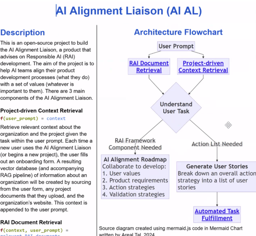
The flowchart shown on the right, created by Ari, describes how the liaison works. Basically, the liaison will first learn about who the user is and what their needs and goals are for their project. Then, it will retrieve information from 2 databases —- one that includes documents related to responsible AI (RAI Document Retrieval) and one with the provided documents and information from the user (Project-driven Context Retrieval) —- and help the user with generating values and building their desired AI product accordingly.
After learning about AIAL and discussing what I can offer to the team, Ari stated that I could lead the front-end design initiative as AIAL’s UX/UI Designer. I am also the team’s first and only designer.
—- original ui of AIAL —-
Before I joined AIAL, Ari has generated a UI for his product vision using an AI. Early on in the process, Ari and I reviewed the original UI (which is not functional from a UX perspective; it’s a high-fidelity prototype). We discussed the connection between features, desired interactive experiences, the basic back-end functionality of each page, and main goal for both the UX and the UI. I made sure to note everything so I had them ready once I begin ideating.
Below are some screenshots of the original AI-generated UI:
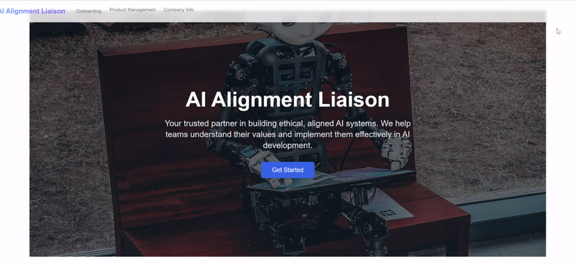
Home (Landing) Page
More Information on Home Page

Onboarding Section
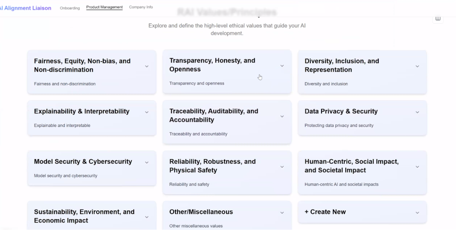
View All Values (View 1)
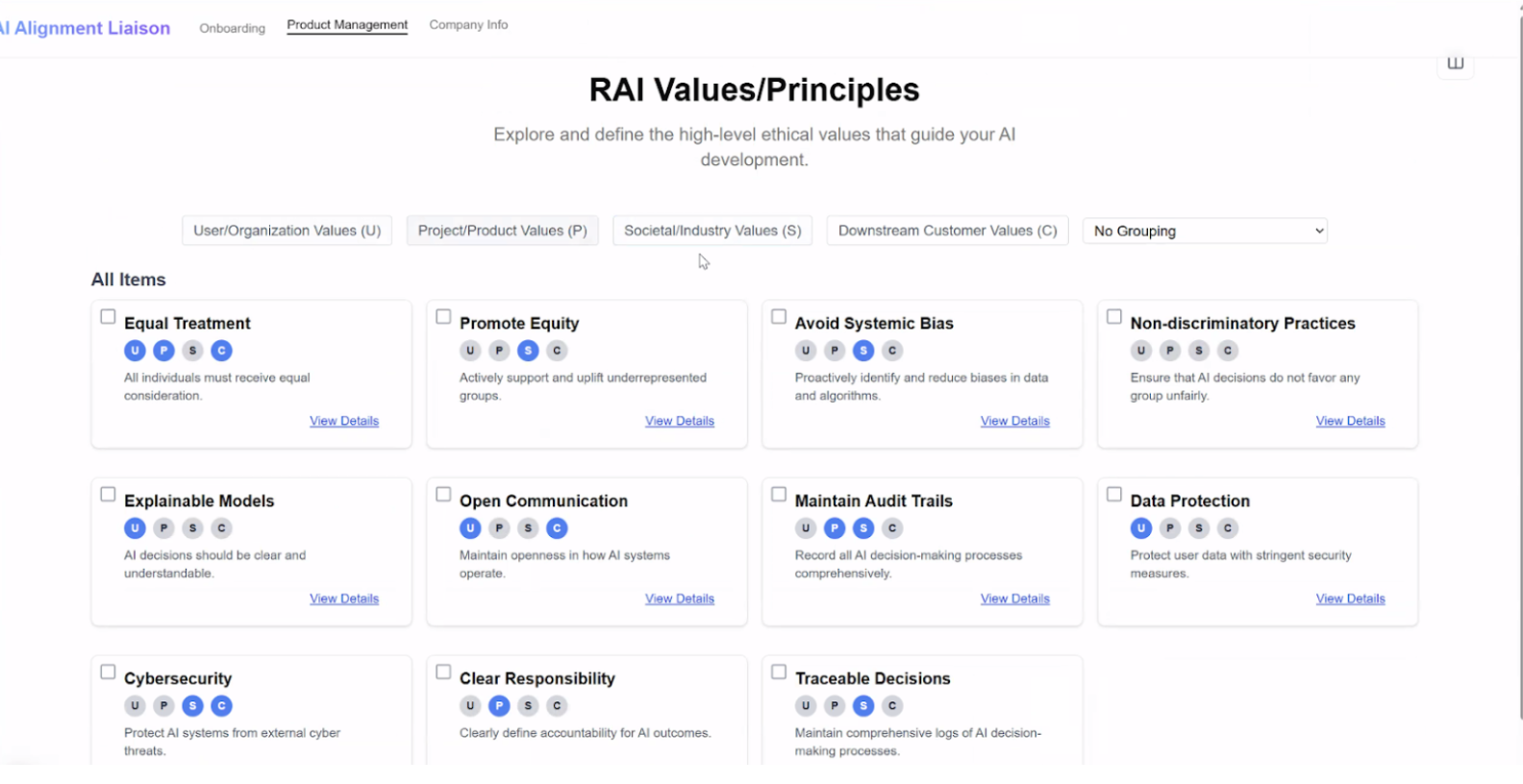
View all Values (View 2)
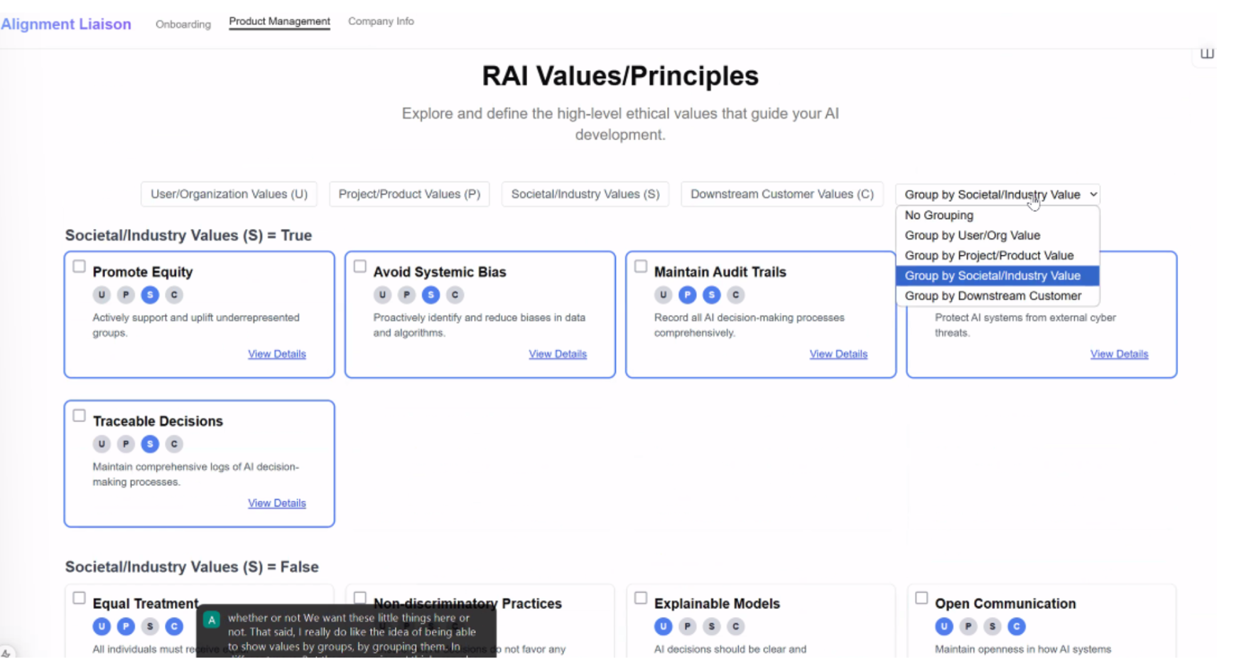
Filter Values (On View 2)
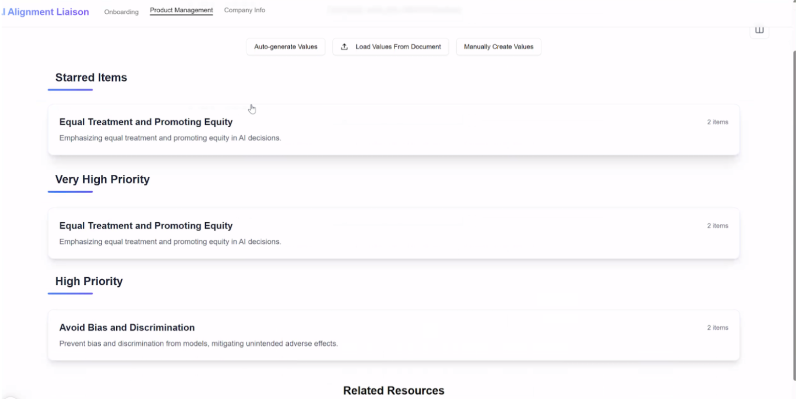
Generate and Organize Specific Values

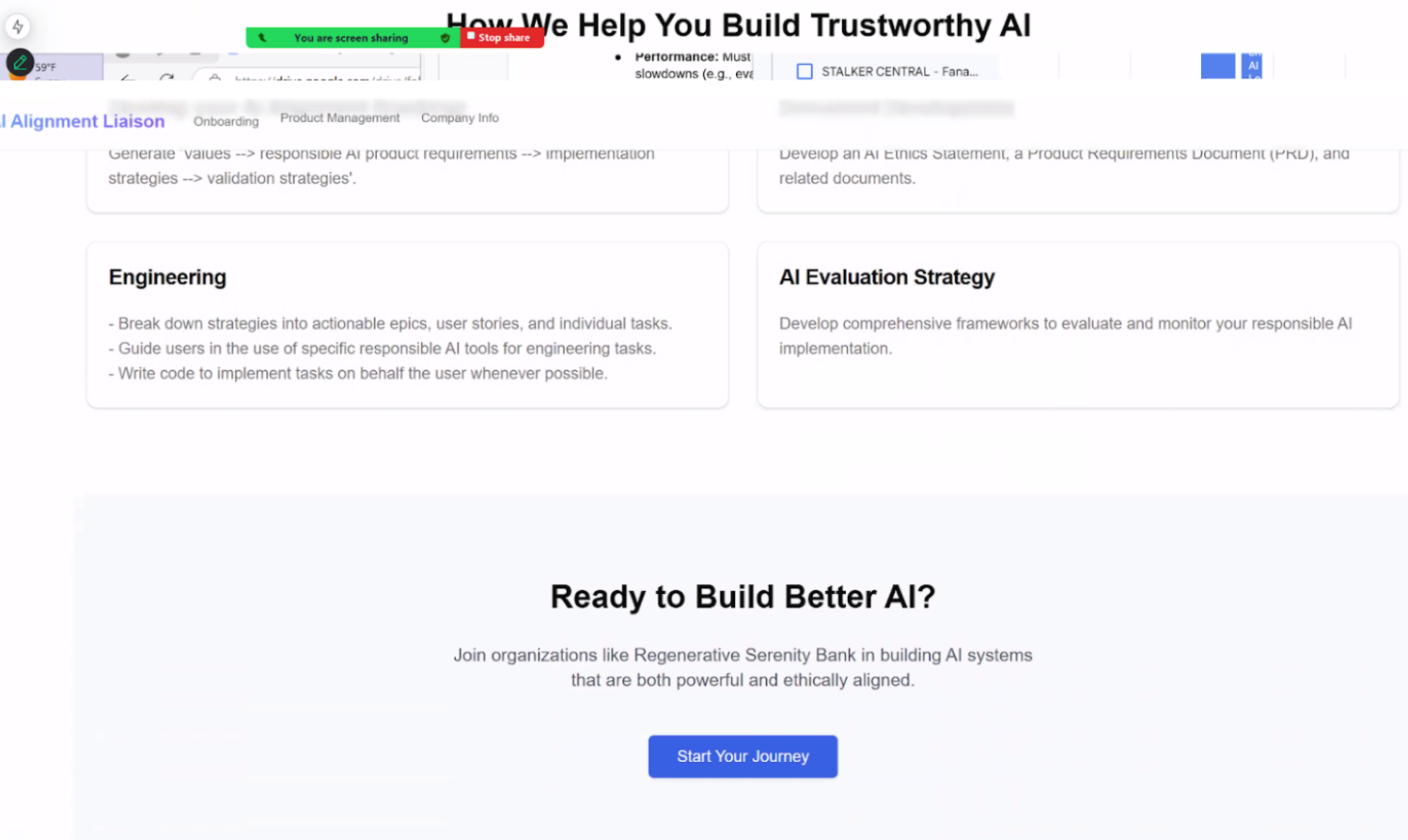
Features Under Product Management
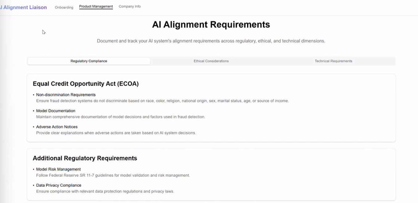
View to AI Alignment Requirements
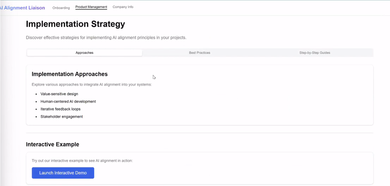
View to All Implementation Strategies
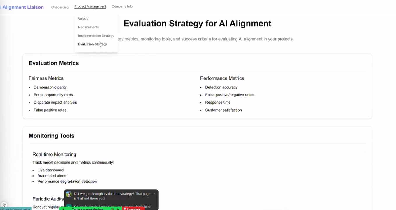
View to All Evaluation Strategies
assessing current AI products
Prior to entering the ideation phase, I wanted to first conduct some market research. More specifically, I wanted to compile a list of other AI products that are currently successful in multiple ways, including (but not limited to):
The tech or AI industry
Generative AI and AI chatbots
Accomplishing specific features (both UX and UI)
I also took a look at AI products from other industries to gain inspiration for other methods of approaching AI design.
Once I completed my research, I presented my findings and thoughts to the team, including demos of the top 5 AI products I found most helpful for our case. My presentation not only helped me understand the liaison better, it also helped the team recognize patterns in how other AI products function, which can then influence their approach to the back-end engineering and management of the liaison.
—- During the Presentation —-
I wanted to ensure that I communicated the importance of this step and why I was presenting my options to the team. I talked about how reviewing current AI products together will help everyone start from the same page and work through a shared foundational understanding of how AI products typically function. (I even gave an analogy of how we look at multiple houses and note what we like and what common patterns we see before buying or building our own.)
I even divided the basic user journey into 4 easily-digestible parts (Onboarding, Values, Product Requirements, Implementation), so I can connect each feature from a current AI tool to some feature or interaction that we plan to include in our own liaison:
As a result of my research and presentation, the team liked the following ideas:
Floating UI chatbot
AI Chatbot to resemble ChatGPT (both visually and funtionally)
Include mostly multiple-choice within the Onboarding questionnaire section
Refer to Julius AI and ClickUp for the overall Onboarding experience
Through further discussion, we also decided to include:
The “4 categories” of values is a temporary detail in the original UI; there will be more types of values that users can filter through in the final liaison
Radical transparency in the AI chatbot
Documents and generated information cannot be submitted to the cloud for safety purposes
When using 3rd party tools for features —- such as ChatPRD for creating product requirements —- we must ask for consent and provide an alternative in case the user isn’t comfortable and wants to avoid leaking important or confidential information regarding the user’s company and product
visualizing our product’s experience
Before stepping into the ideation phase, I wanted to make sure that I understood the functionality and features of the liaison accurately. So, I created some flowcharts: one for the user flow and three that depict various approaches to the site map based on the user journey. Click on them to view it larger.
User Journey Flowchart

Site Map Flowchart 1
Site Map Flowchart 2
Site Map Flowchart 3
By visualizing the features, functionality, and flow of the liaison through flowcharts —- and presenting them to the team —- I could ensure that everyone was on the same page about how they imagined and approached the creation of our product. A few team members have also specifically called out how my ability to visualize the UX and functionality of the product in a simple manner and without built-out wireframes has helped their understanding of the back-end work.
Plot twist: two projects in and one step back
—- The Step Back —-
With market research completed and having a clear user journey and site flow to work from, you would think that I’m ready to move onto the ideation phase. However, if you noticed, there was still one step missing: user personas.
That’s right. How did I get to the user journey without actually talking to potential customers and building a user persona? Well, since AIAL is still quite new, there is no defined target audience just yet. The user flow we finalized on is based simply on a happy path for a hypothetical product. I cannot start designing a product without considering who our users were and what they may need. So, I took a step back and discussed my thoughts with Ari.
Ari explained that, while he appreciates my stance for doing things the right way and not skipping crucial steps just to produce a design, he and other team members from the back-end side are still working towards conducting Customer Insight Interviews (amongst many other smaller projects that are time-bound for building a functional liaison). While I offered my experience and skills to aid in the customer interviews and build user personas, the business was not ready for that just yet.
So, we came to a conclusion: by building a low to medium-fidelity wireframe, we would have visual examples to show potential customers during the interviews. This way, I could continue with my ideation and design process without worrying about perfection, as I am expected my initial designs to change based on feedback. I will prioritize screens that clearly communicate the purpose and features of the liaison, instead of imagining each screen and interaction that may occur within the final product.
I could also take these initial wireframes and conduct a user experience-specific concept testing myself, which I planned to accomplish once I complete the necessary wireframe designs. To view what I came up with at this point, look at the designs below. To view any image larger, click on them.
Hand-Drawn Low-Fidelity Wireframes
Home/Landing Page
Ideating both content and UI for the Home page, including what AIAL is about and how the liaison itself works from the back-end perspective.
About Page
Dividing the information and ideation the organization about who the team is between the About page and the end of the Home page.
Onboarding Idea 1: 3-Part Pop-Up
Typical 3-part Onboarding style through pop-up screens, where users answer questions and upload documents prior to entering the liaison.
Onboarding Idea 2: Dashboard
User directly goes into the Onboarding section of the dashboard. They complete the questionnaire & upload documents here before going to the AI chatbot. We finalized this idea since it gives users accessibility and control over the onboarding.
Onboarding Idea 3: AI Chatbot
This would be a Chat-GPT style Onboarding, where the AI will ask both pre-determined and personalized questions at once, including uploading documents.
figma low and medium-Fidelity Wireframes
Home/Landing Page (Scroll Video)
Adding Features to the Basic Dashboard Outline
Hiding the Side Navigation
Basic Low-Fidelity Outline of Dashboard
New Side Nav & New Location for “New Project” Feature
Potential Features to Include Under Profile
—- The two projects —-
There was another twist to the story: one project divided into two.
How did this happen? Well, until this point, I knew that the team was working towards both the prototype and the MVP for the liaison. However, after a few meetings, I realized that not everyone was using these terms the same way. So, I individually met the team members I work with more frequently —- including Ari himself —- and discussed what everyone’s understand of AIAL’s “Prototype” and “MVP” was (in addition to the progress and goals of their current work).
In the end, I finally discovered that, for our team, the definitions and expectations are as follows:
Prototype: A basic functional version of our liaison that will be used for concept testing and internal use by the other team members. The Prototype is a high priority and must be completed as soon as possible. All the other team members are actively working towards this alone. Here, functionality and clear communication of the idea is valued over perfect user experience or a clean UI.
MVP: This is the first real version of the liaison that customers interact with. It doesn’t need to have all of the features in it; just the most important ones that will allow users to complete basic tasks (like generate values or follow implementation strategies). The final user experience and UI design will be based on research and extensive usability testing. While working towards the MVP is important, it isn’t placed at the highest priority.
After discussing with Ari, I have decided to slightly switch gears to prioritizing the Prototype over the MVP. This translates to me editing and adapting the original AI-generated UI just enough where it clearly communicates the features, functionality, and flow of the liaison.
However, we both also agreed that my work towards the MVP not only accelerates the team’s progress and helps everyone understand and visualize what they’re working towards, it also brings in a level of quality and finesse in the Prototype, as well. So, I will also continue to ideate towards the MVP and create new wireframes whenever possible.
MVP: The Onboarding and AI Chatbot project
—- The onboarding —-
The Onboarding section in the MVP is an interesting challenge. Before I get there, though, let me quickly explain what the Onboarding section is.
The Onboarding section is where users would provide the liaison with context and documents related to their product, business, and goals. This involves 3 parts: answering a questionnaire, uploading all relevant documents, and completing a personalized interview by AIAL’s AI chatbot.
Now, as we continue to explore the functionality and purpose of the liaison, Ari and I recognized that we cannot provide the same questionnaire or onboarding experience for users who may have vastly different needs and use cases for the liaison. After all, this is an open-source project, and users of any role or building any kind of AI product should be able to use only what they need from the liaison. This means that, in addition to discovering how to best present the questions to each user, I will also be involved with deciding what questions to ask in various scenarios.
Here are some ideas I came up with:
2-Part Onboarding: Before the user enters the Onboarding section of the dashboard, they must first answer a pop-up with 1-2 questions regarding their role and goals (Part 1). The questions asked in the Onboarding section will be provided accordingly (Part 2). Users would then go to the AI Chatbot for the AI Interview afterwards.
Conditional Questioning: Instead of having a pop-up prior to accessing the dashboard, the same initial user-discovery questions will be asked directly on the Onboarding section. Based on the answers, the relevant questions from our pre-set questionnaire will follow. The rest of the questions won’t necessarily all show up at once, though. Each question will show up based on the how the user has answered the previous questions, but there will be a limit to how many questions the liaison is allowed to ask (to avoid fatigue and user attrition).
I also prompted ChatGPT for some ideas, just to see if it could spark inspiration for something new. Interestingly, its top suggestions matched my own ideas, but it also provided:
Multiple Mini Onboarding: This idea might be more relevant for future phases of the liaison, but this format divides the questionnaire into sections relevant for each feature accessible by the dashboard. Users will complete the relevant onboarding questionnaire only when they get to that feature. This avoids unnecessary effort spent in Onboarding in advance, and it allows users to control when they give the liaison information.
Various Liaison Views: This idea requires various versions, or view styles, of the liaison depending on the user’s role. So, depending on which “liaison view” the user chooses, the questionnaire they receive varies accordingly.
Sidebar AI: Similar to how the side navigation is accessed on the left side of the dashboard, a sidebar AI would provide a full-length view and access to the AI chatbot on the right side of the dashboard. This allows —- and even encourages —- constant interaction with the AI chatbot throughout the user’s journey. It’s important for me to keep in mind that, while it gives more room for users to use the chatbot, it reduces working space on the dashboard.
Floating AI: This approach to the AI chatbot is very common in most digital platforms, as it lives as a pop-up on the bottom-right side of the screen, and it’s accessible regardless of which page or feature the user is on. By providing a smaller and collapsible version of the chatbot, users can prioritize their work on the dashboard while the AI chatbot functions as a co-pilot (which is a major characteristic to consider).
After discussing my findings with Ari, I finalized the top 2-3 ideas to be 2-Part Onboarding, Conditional Questioning, and the Multiple Mini Onboarding and decided to present them to the rest of the team (including prototyped visuals to improve understanding). I also mentioned the Sidebar AI and the Floating AI ideas in my presentation, since they are involved in the onboarding experience (albeit a different experience). I didn’t just list these ideas in my presentation; I discussed the pros and cons of each, as well as how multiple ideas can be combined (i.e. 2-Part Onboarding with a Sidebar AI).
—- The onboarding Presentation Results —-
My ideas were very well received. Given that our final decision will be based on usability testing, the team favored the following ideas:
2-Part Onboarding
My team liked the concept of having an option to decide which pre-defined questionnaire to provide based on a 1-2 question long pop-up.
Conditional Onboarding
My team liked the concept of having all of the questions appearing on one page, which will prevent navigation fatigue for users.
Floating AI
My team liked the concept of allowing users to open the AI chatbot at any time (like a co-pilot) that won’t interfere with the main task.
Floating + Sidebar AI
My team liked the concept of giving users an option to choose their AI chatbot format to match their needs or workstyle with flexibility.
Prototype: Improving the current UI
—- The issue —-
As previously mentioned, the Prototype is the highest priority. From a design perspective, this means that I must improve the current prototype (the screenshots of which were provided under the first section, Joining the Team, in a way that best represents the idea of the product and minimizes user experience issues during demos and usability testing.
To achieve this, I completed a basic Heuristic Evaluation and a UI audit, which included taking down detailed notes of:
Everything that needs to be fixed (from both a UI and UX perspective)
Things that will be nice to fix (but aren’t high-priority)
Reminders from previous discussions regarding the Prototype (i.e. updating content and features)
Any questions or doubts I had regarding the UI or the product experience
From here, I did a quick presentation to the team about my thoughts and noted down feedback and answers to my notes. Ari and I also decided to meet frequently in the coming days to vibe-code all of the decided changes into the UI together.
—- The solution —-
The following will show what each of the issues I found and the solutions I’ve implemented so far into the final Prototype:
Page/Feature
Issue
Solution
Created image to represent guidance and connection
Home Page
Hero image of a robot didn’t match brand
Navigation Bar
Onboarding
CTA button at the bottom of short-scroll page
Removed button due to unnecessary repetition
Links were not vertically aligned to the logo
Mega menus weren’t identified differently
Included drop-down carets to express more options
The current content didn’t match our ideas
Defined and updated the content to represent liaison
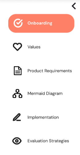
5 tabs made onboarding extensive
Changed to 3 simple tabs to reduce Onboarding effort
“Complete” button is falsely finite
Re-coded the alignment and flexbox to fix issue
Rewrote to “Proceed to AI Interview” for accuracy
Users scroll down to move forward or back
Made the 3 Tabs clickable for easy navigation